A System and Its Spreadsheets
RIO is the second most used Electronic Patient Record system in the UK, and the most used EPR across Mental Health Trusts. It has dozens of modules covering everything from inpatient management to clinical assessments. One of those modules handles Mental Health Act administration: the legal side of detaining patients, tracking section expiry dates, coordinating hearings, ensuring patients are informed of their rights, and managing consent to treatment.
The MHA module was built over 15 years ago. Staff were entering data into it, but that data wasn't being used for anything meaningful. No reporting, no dashboards, no automated reminders. The information went in and sat there.
So administrators built their own systems. Every Trust I spoke to had Excel spreadsheets tracking the same things the module should have handled: section expiry dates, upcoming hearings, consent review deadlines, rights notifications. One Trust went further and built an entire replacement system in Microsoft Access.
This created a vicious cycle. The module didn't do anything useful with the data, so staff had no reason to keep it accurate. The less accurate the data became, the less anyone trusted it. The less anyone trusted it, the more they relied on their spreadsheets. And the more they relied on spreadsheets, the less reason there was to fix the module.
(All screenshots display fake data and not real patient information)
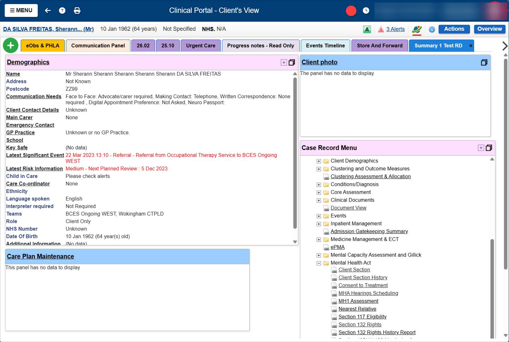
Navigating to MHA information meant searching for a patient, clicking into their record, scrolling through a folder tree of every clinical module in the system, finding the Mental Health Act folder, expanding it, and clicking into whichever sub-page you needed. Section details, section history, hearings, consent to treatment, rights: all separate pages, all buried.
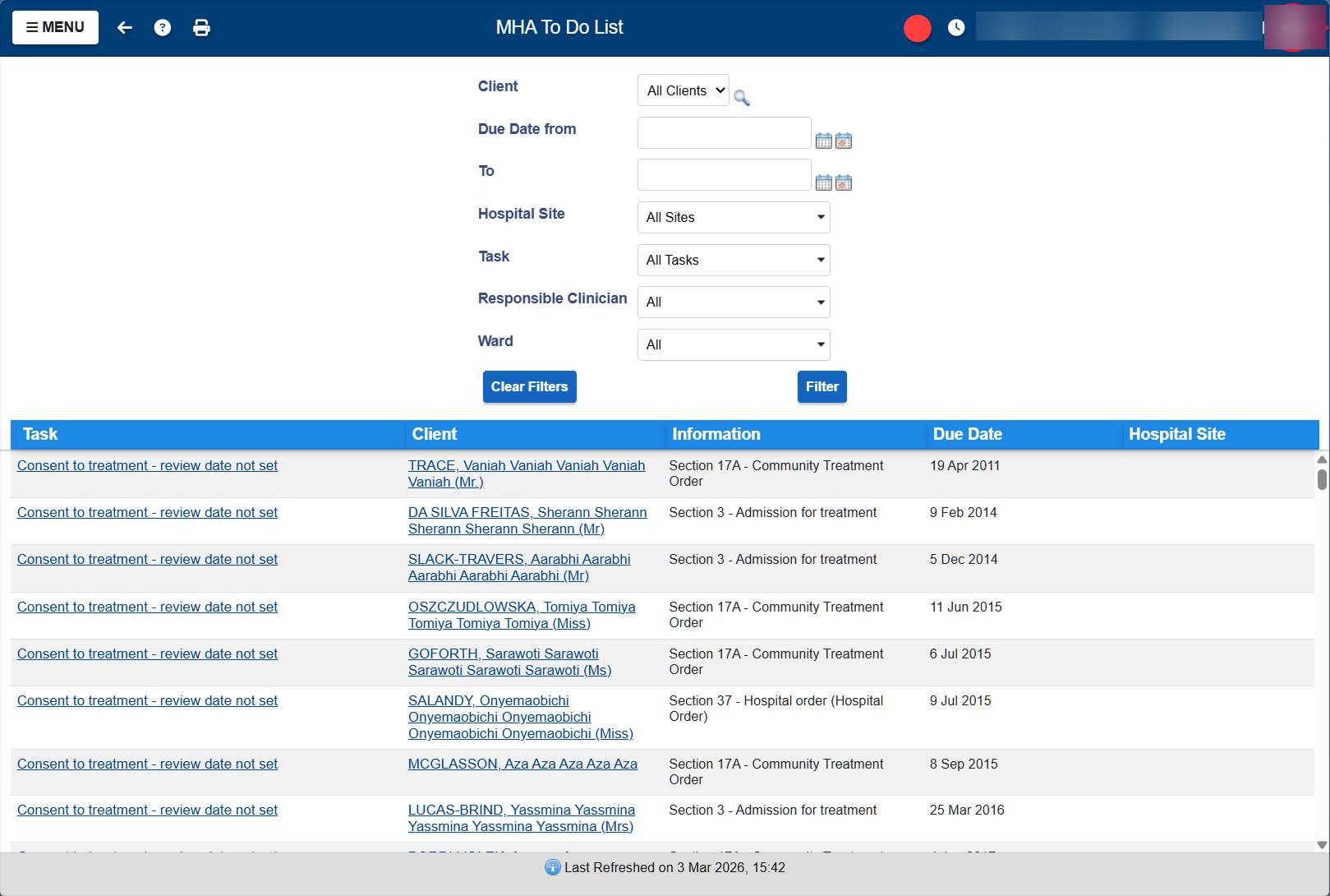
The to-do list existed but was barely used. No filtering by ward, no sorting, no priority indicators. Every row looked the same whether it was due yesterday or overdue by five years.
I was tasked with redesigning the MHA module. But once I understood what was actually going on, the first step became clear: create enough value for administrators that they'd have a reason to log data in the first place. High gains with low effort. If the system could show them something useful in return for their input, the data quality problem would start solving itself.
The Research
There was no existing research on how MHA Administrators use the module. No previous studies, no reports to build on. I had to start from scratch.
I ran 25+ remote interviews with MHA Administrators across multiple NHS Trusts. The early calls were about understanding the basics: what does an administrator actually do all day, what are the legal obligations they're tracking, how do they use the current system, where does it break down. Each call surfaced new details. Administrators showed me their screens, walked me through their processes, and pulled up their Excel spreadsheets to show me what they were really using to manage their work.
But there's a limit to what you learn on a video call. People normalize their pain. They forget to mention the workaround they've been doing for eight years because it just feels like part of the job. And there's information they won't show you on a recorded call, like real patient records.
So I went on-site. Six hospital visits, spending 4-6 hours each time sitting next to administrators, watching them work. They showed me real cases, real patients with long histories, real spreadsheets with actual data. I could see the full picture: the constant switching between RIO and Excel, the manual cross-referencing, the email chains to wards about upcoming deadlines. Things that never came up in a 45-minute video call became obvious after three hours of shadowing.
After the research I understood the domain well enough to start proposing solutions rather than just asking questions. I designed a first version of the key screens and went back on-site to validate with administrators. Some things I got right from understanding the workflows and the law. Other things, like surfacing 132 Rights deadlines and nearest relative information on the patient list, came directly from administrators pointing out what they check constantly that I had no way of knowing from the outside.
Working with AI
All my interview transcripts, the RIO MHA documentation, and the database structure documentation live in a Claude Project. When I need to cross-reference something an administrator said with how the database actually stores that information, I ask Claude to pull it out. Instead of manually searching through hours of call transcripts, I can get synthesized answers in seconds.
The design process starts there too. I look at the specifications, work out what's needed and how it should behave, then ask Claude to generate an HTML mockup. I iterate on that mockup until the structure and interactions feel right. Once I'm happy with it, I ask Claude to write a full implementation prompt for our internal prototyping tool, which is similar to Lovable. That tool builds the actual frontend. From there, I go in and modify the functionality, adjust components, and refine until it works.
This isn't a throwaway prototype. The frontend I'm building is the production code. It gets validated with administrators and it ships. I'm designing, prototyping, and engineering the same product, with AI bridging the gaps between those roles.
Beyond individual screens, I'm also building the component infrastructure. Our stack uses Tailwind and shadcn/UI with custom components, but there were gaps in what was available: no proper data table, no proper date/time picker, no consistent filtering patterns. So I designed how filters work across the product, how they appear as chips, how users can save filter configurations as views, how the dropdown behaves with active filters. Then I built those components and wrote Markdown specification files so our LLMs know how to apply them correctly. When another team needs filters in their product, the component exists, it behaves consistently, and the AI knows how to use it.
This is the part of the work that scales beyond MHA. Every component I design, build, and document becomes part of a shared system that other products and other designers can use through the same AI-assisted workflow.
The Cross-Product Discovery
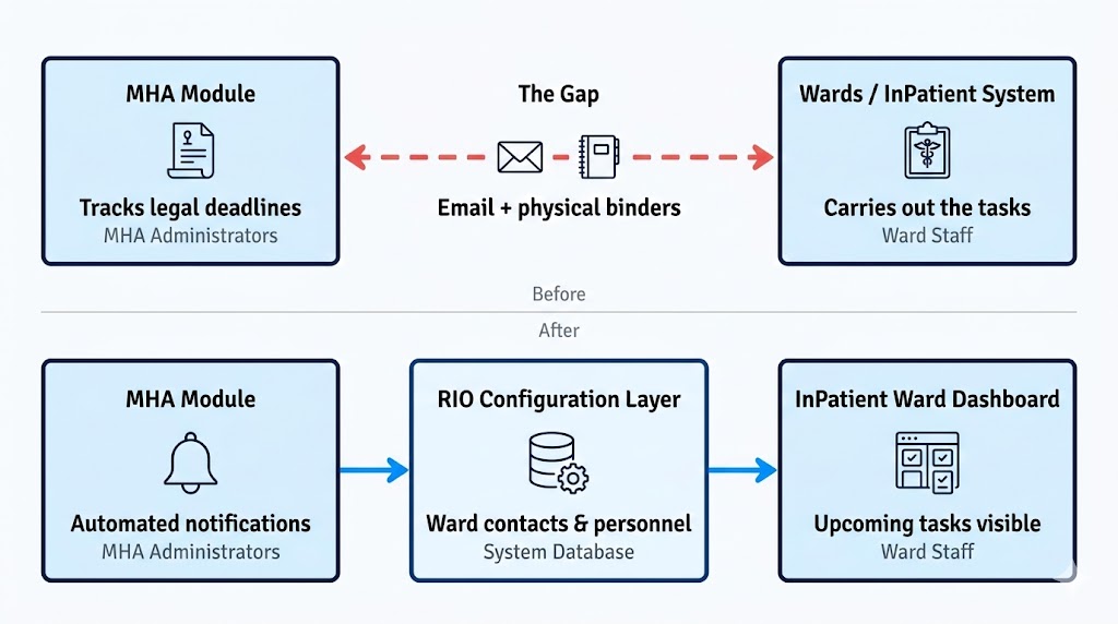
One of the biggest problems I found had nothing to do with the MHA module. It sat in the gap between products.
Administrators are responsible for making sure legal deadlines are met: sections renewed before they expire, hearing reports submitted on time, rights read to patients. But administrators can't do most of those things themselves. The wards do the actual work. And the only way administrators had to communicate with wards was email. Some Trusts had binders with ward email addresses. The administrator would look up the ward, write an email, and hope someone would act on it. If they didn't, the administrator would follow up. And follow up again.
This problem never surfaced when I worked on the InPatient system. From the ward's perspective, there was nothing broken. Someone emails them, they deal with it. The pain only becomes visible from the administrator's side, where they're the ones accountable if a legal deadline gets missed.
No single product could fix this. It required changes across three systems. In MHA, the email chasing needs to be replaced with notifications. In the RIO configuration layer, wards need contact details and personnel attached to them so the system knows who to notify. In the InPatient ward dashboard, upcoming section expirations, hearing deadlines, and rights notifications need to appear as cards so ward staff can see what's due without waiting for an email.
I'm now coordinating with the product managers responsible for each of those systems. I already redesigned the ward configuration once before, and I may end up designing the ward dashboard changes too. None of this would have been visible if I'd only looked at the screens I was assigned.
The Structure I Built
After the research, I had a clear picture of what administrators need and what the old system wasn't giving them. What follows is a walkthrough of the key pages I designed, why they exist, and what problems they solve.
My Week
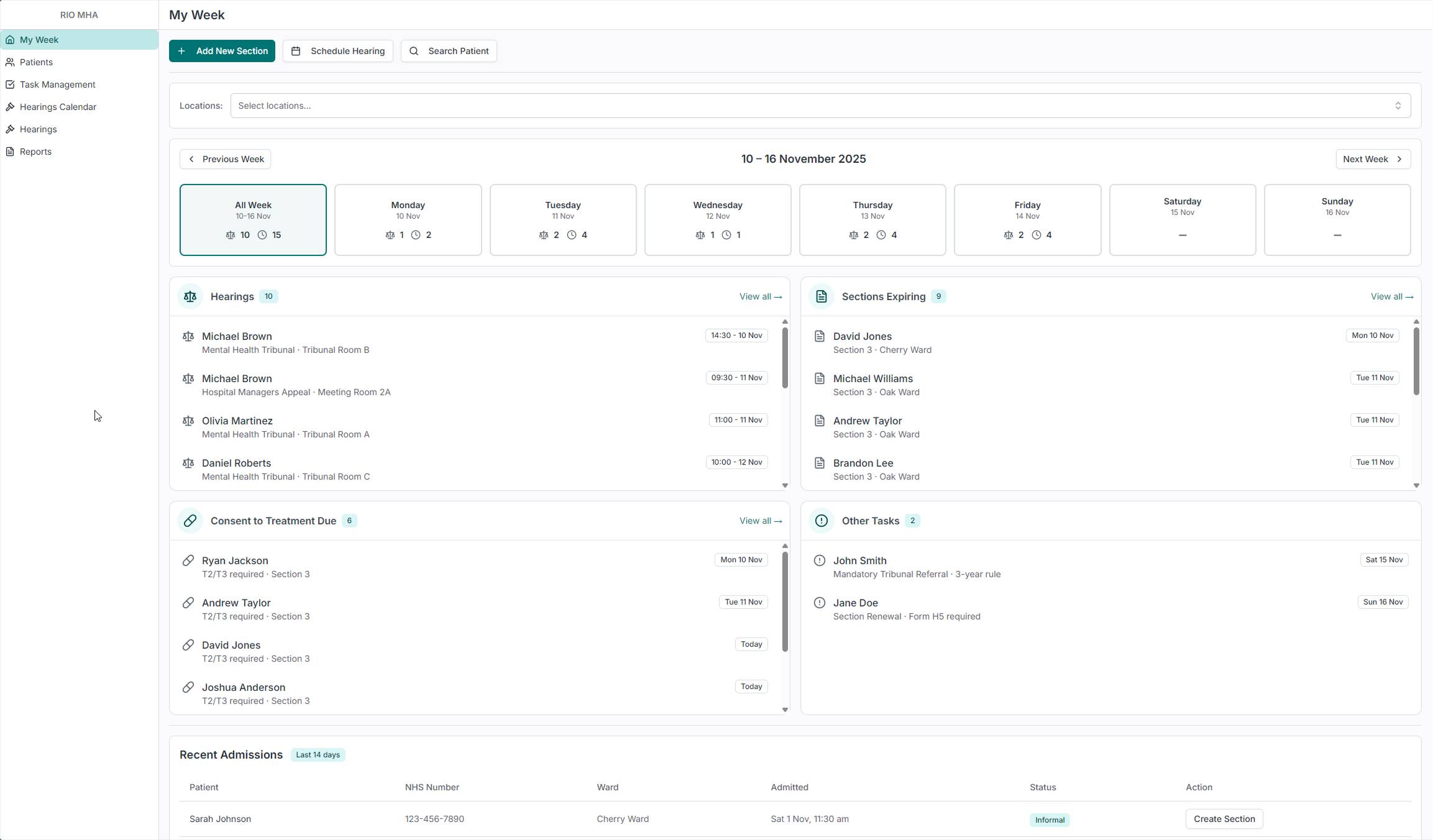
When teams build dashboards, the default instinct is KPIs. Numbers, arrows, percentages. Managers love those. But the people who open the tool every morning aren't managers. They're administrators with a caseload of patients and a week full of legal deadlines. They don't need to know that compliance is at 94%. They need to know that three hearings are happening on Tuesday and a section expires on Friday.
So I didn't build a dashboard. I built My Week. It shows the administrator's actual workload for the current week, broken down by day. Four buckets: Hearings, Sections Expiring, Consent to Treatment Due, and Other Tasks. Each one has a count. Click on a day and see just that day's work. Filter by location to see only the wards you're responsible for.
This is the screen that breaks the vicious cycle from the old system. If an administrator logs in Monday morning and immediately sees what's due this week, the data has value. There's a reason to keep the system updated. The spreadsheets become redundant.
At the bottom, a Recent Admissions table shows patients admitted in the last 14 days. Administrators need this because ward staff sometimes forget to send documentation for newly admitted patients. This lets them spot new arrivals and follow up before anything falls through the cracks. Patients arrive as informal first, and administrators are the ones who add the section, so seeing new admissions early means nothing gets missed.
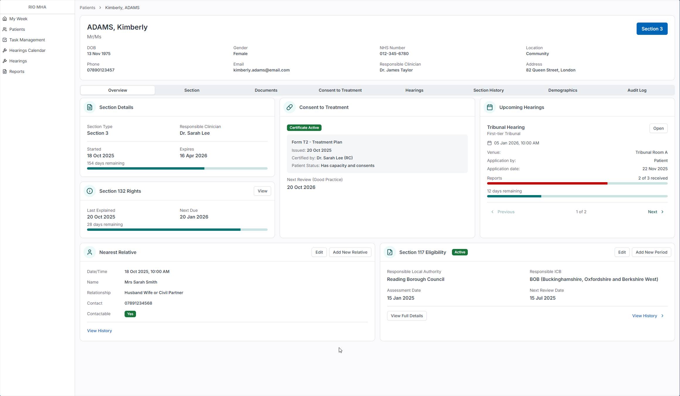
Patient List
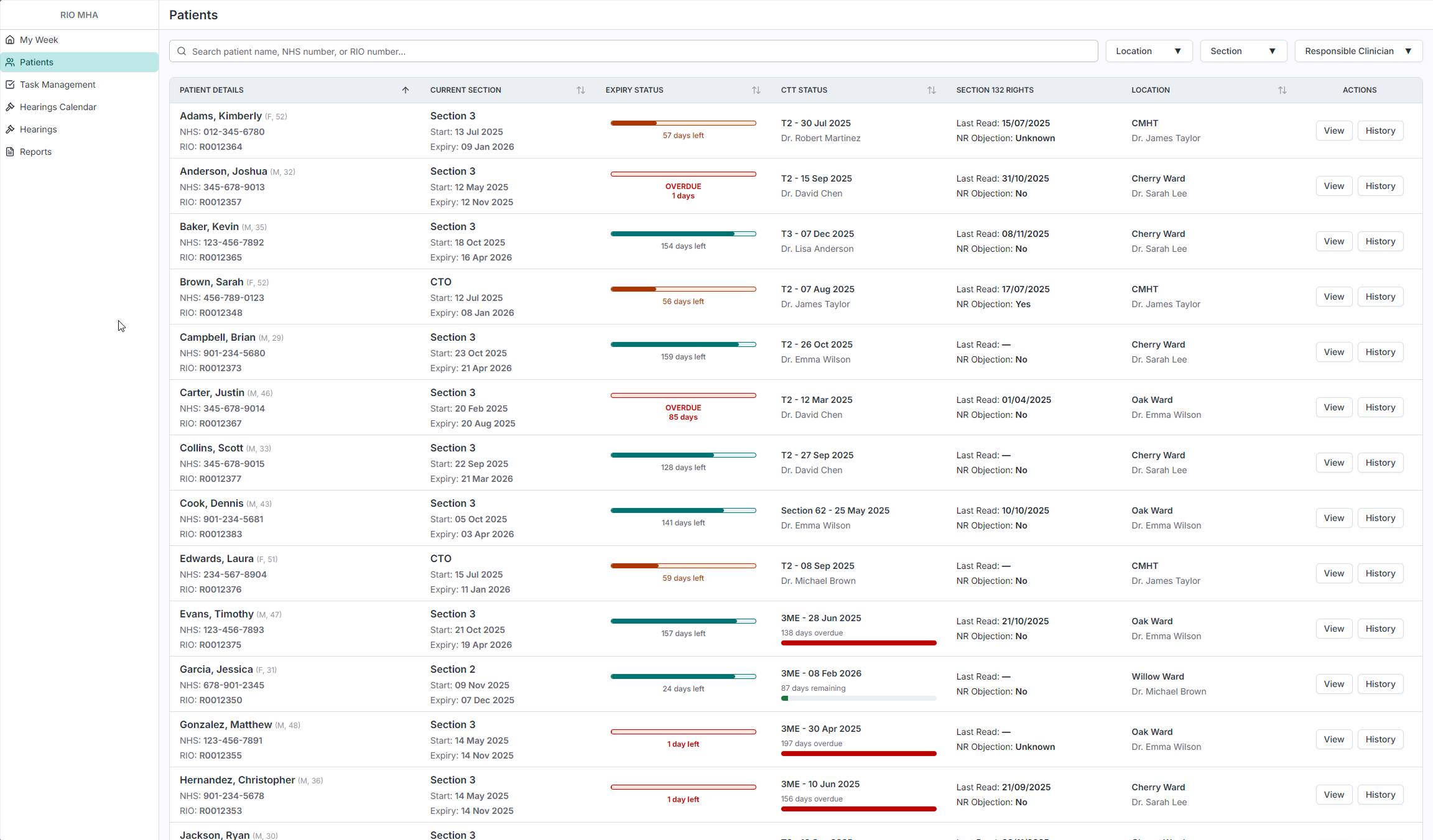
The patient list shows every patient in the hospital who is currently under a section. At a glance, an administrator can see the patient's current section, how many days until it expires, their consent to treatment status, when their 132 Rights were last read, and which ward they're on. The expiry status bars give an immediate visual read on urgency: green means time, red means overdue. The table is sortable and filterable by location, section type, and responsible clinician, and the system is tailored to the person using it, so each administrator sees their own caseload without having to set anything up.
Administrators loved the bars. In the old system, checking whether a section was about to expire meant clicking into each patient individually. Now that information is visible across the entire caseload in one scan.
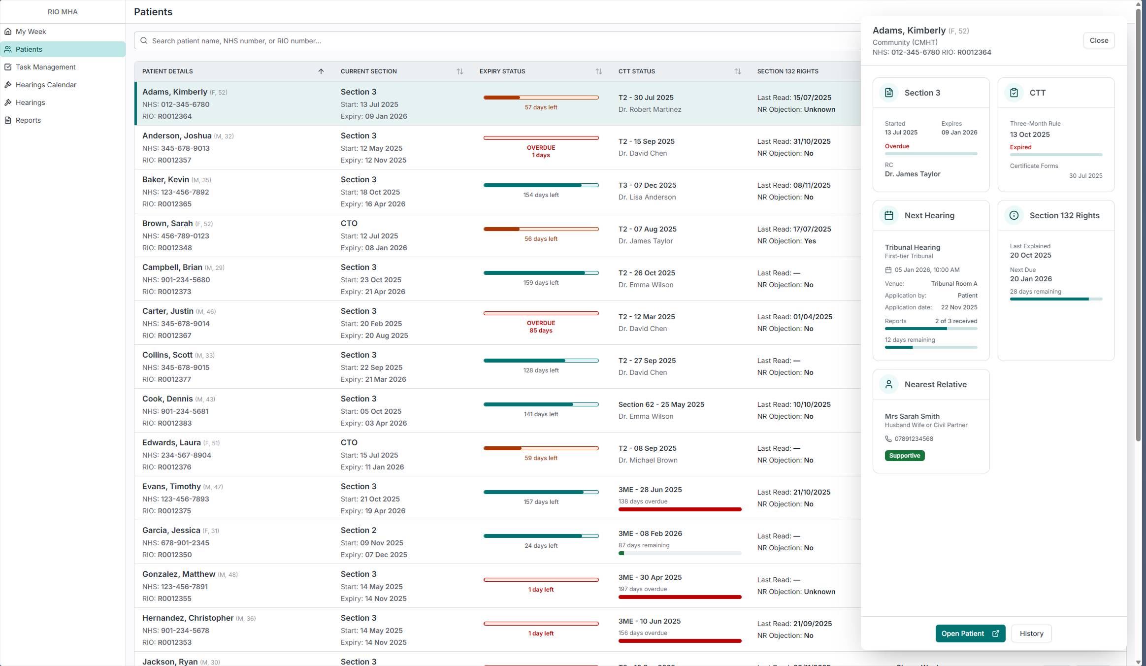
When an administrator clicks on a row, a sidebar panel slides in with more detail: section status, consent to treatment, next hearing with report progress, 132 Rights, and nearest relative. This means they can do a quick check on a patient without leaving the list. There are three levels of detail: the list row for scanning, the sidebar for a quick check, and the full patient page for a deep dive. The administrator picks the level they need without being forced into a page they don't want.
Patient Details
In the old system, an administrator had to navigate through a folder tree inside the full clinical record to reach any MHA-related information. Patient demographics, care plans, clinical assessments, medication - all of it was in the same view, and the MHA pages were buried several clicks deep.
The new Patient Details page is a dedicated view built for MHA Administrators. The Overview tab shows six cards: Section Details with days remaining, Consent to Treatment with certificate status, Upcoming Hearings with report progress, 132 Rights with the next due date, Nearest Relative with contact details, and Section 117 Eligibility. Each card answers a different question an administrator would ask about a patient, and all of them are visible without scrolling or clicking into sub-pages.
This isn't the old clinical portal with things removed. It was designed from scratch based on what administrators actually need to see about a patient's legal status. The tabs along the top separate each concern into its own space, but the Overview gives enough information that most quick checks don't require going deeper.
Documents
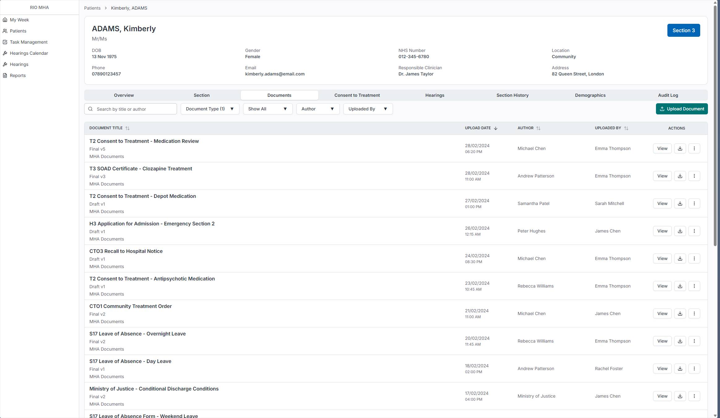
In the old system, MHA documents lived in the central RIO document store alongside every other clinical document. Administrators had to navigate there and filter by document type to find anything MHA-related. Since MHA is being split into its own product, I brought the documents inside the patient view so administrators don't have to leave the tool to check or upload paperwork.
The Documents tab shows all MHA-related documents for that patient with filters for document type, author, and who uploaded it, plus a search function. Each document shows its version status (Draft or Final) so administrators can tell at a glance whether something is still in progress.
Patient Details - Hearings
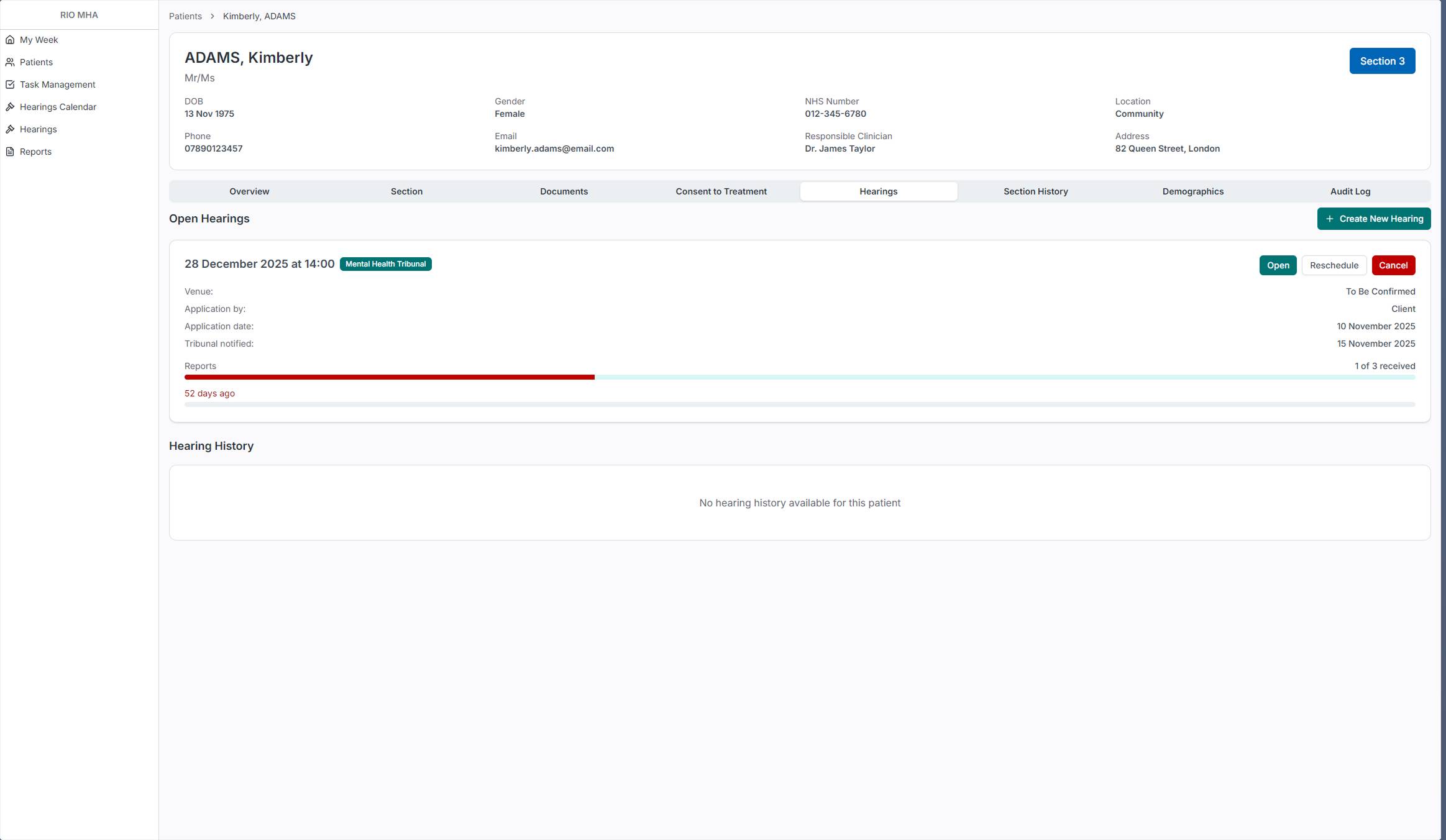
The Hearings tab on the patient page shows all open hearings for that patient with their report progress. The progress bar makes it immediately visible whether reports have been received or are overdue. From here an administrator can open a hearing, reschedule it, or cancel it.
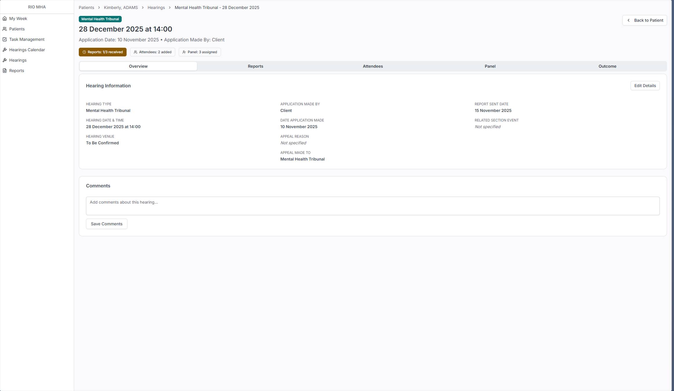
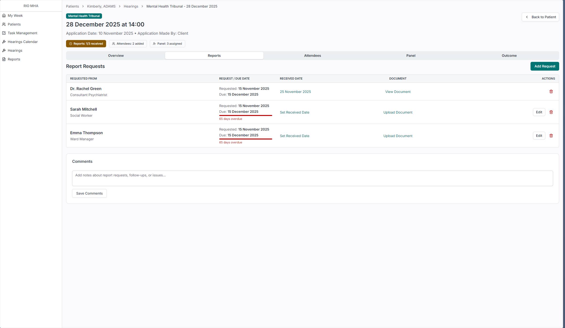
Opening a hearing takes you to its own detail page with tabs for Overview, Reports, Attendees, Panel, and Outcome. The status badges at the top give an instant read: how many reports have been received, how many attendees are added, whether the panel is assigned. The Reports tab shows exactly who was asked for a report, when it was requested, when it's due, and whether it's been received. Overdue reports are flagged in red. This is the kind of tracking that administrators were doing in spreadsheets before.
Hearings
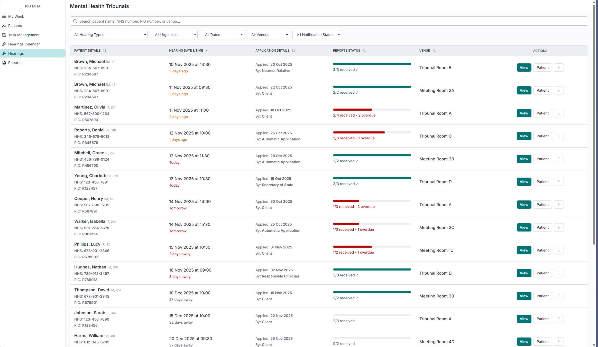
Hearings are one of the most time-sensitive parts of the administrator's job. The dedicated Hearings page shows all upcoming hearings across every patient, with report status front and center. The progress bars immediately show which hearings are ready and which have overdue reports that need chasing. Filters for hearing type, urgency, date, venue, and notification status let administrators focus on what needs attention.
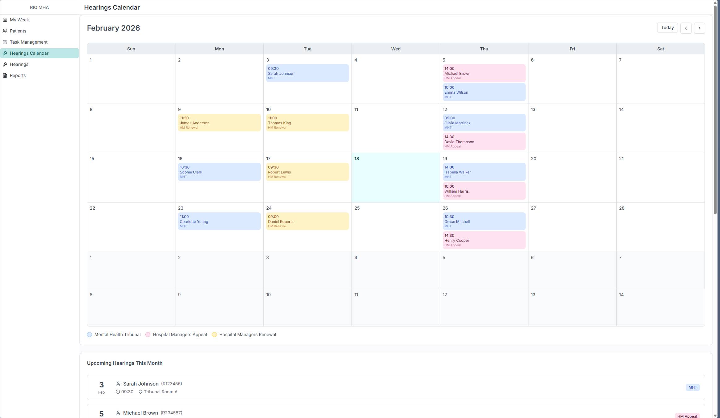
The calendar view was requested directly by an administrator during one of the on-site visits. It shows the same data in a monthly layout, color-coded by hearing type: Mental Health Tribunals, Hospital Managers Appeals, and Hospital Managers Renewals. Below the calendar, an upcoming list gives a quick linear view of what's next. Some administrators think in lists, others think in calendars. Both views exist because the research showed both were needed.
From Prototype to Production
The prototype has been validated with MHA Administrators across multiple Trusts. The reactions during those sessions confirmed the research had landed. Administrators recognized their own workflows in the product. Features like the expiry status bars, the My Week dashboard, and the hearing report tracking addressed problems they'd been working around for years.
There are real constraints on this project. The backend database is the same legacy system, so everything I design has to work within that existing structure. Time is limited, and not everything from the validated prototype can ship at once. So I had to prioritize an MVP, the set of features that delivers the most value to administrators while being realistic about what can actually be built and released.
The product is now being delivered feature by feature. I'm splitting the validated prototype into chunks, prioritizing the pages that deliver the most immediate value, and building each one into production using the same AI-assisted workflow. Every feature goes from the validated design, through Claude for implementation prompts, into the internal tool for frontend code, and then into production.
This is still ongoing work. The notification system that replaces the email chasing isn't built yet. The ward dashboard changes are still in coordination with other product teams. The document emailing feature is planned for a future version. But the core of the product, the pages that give administrators a reason to trust the system with their data, is being shipped now.
I have full ownership of this product. I'm designing it, building the frontend, coordinating with backend developers, and delivering it. The role has evolved from Product Designer into something closer to a Product Engineer, and that's the direction I'm heading.