My general approach to audits & reviews
I played the game as a player first, not a designer. I don't have access to their analytics, so some of what I flag here might be intentional and performing well based on data I can't see. This audit is based purely on what the new player experience feels like from the outside.
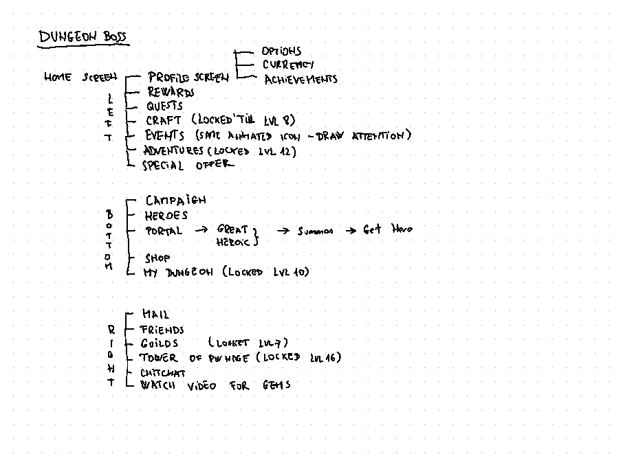
Sitemap
First thing I do with any audit is map out the sitemap. Writing each screen down forces me to think about the purpose of each page before I even click on it. What is the game trying to show me, and in what order?
Research
Before diving into the analysis, I checked the game's online presence: YouTube channels, Reddit, community forums. I want to see what real players are already saying about a product before I start forming my own opinions. I also looked at AFK Arena as a competitor reference.
Home Screen
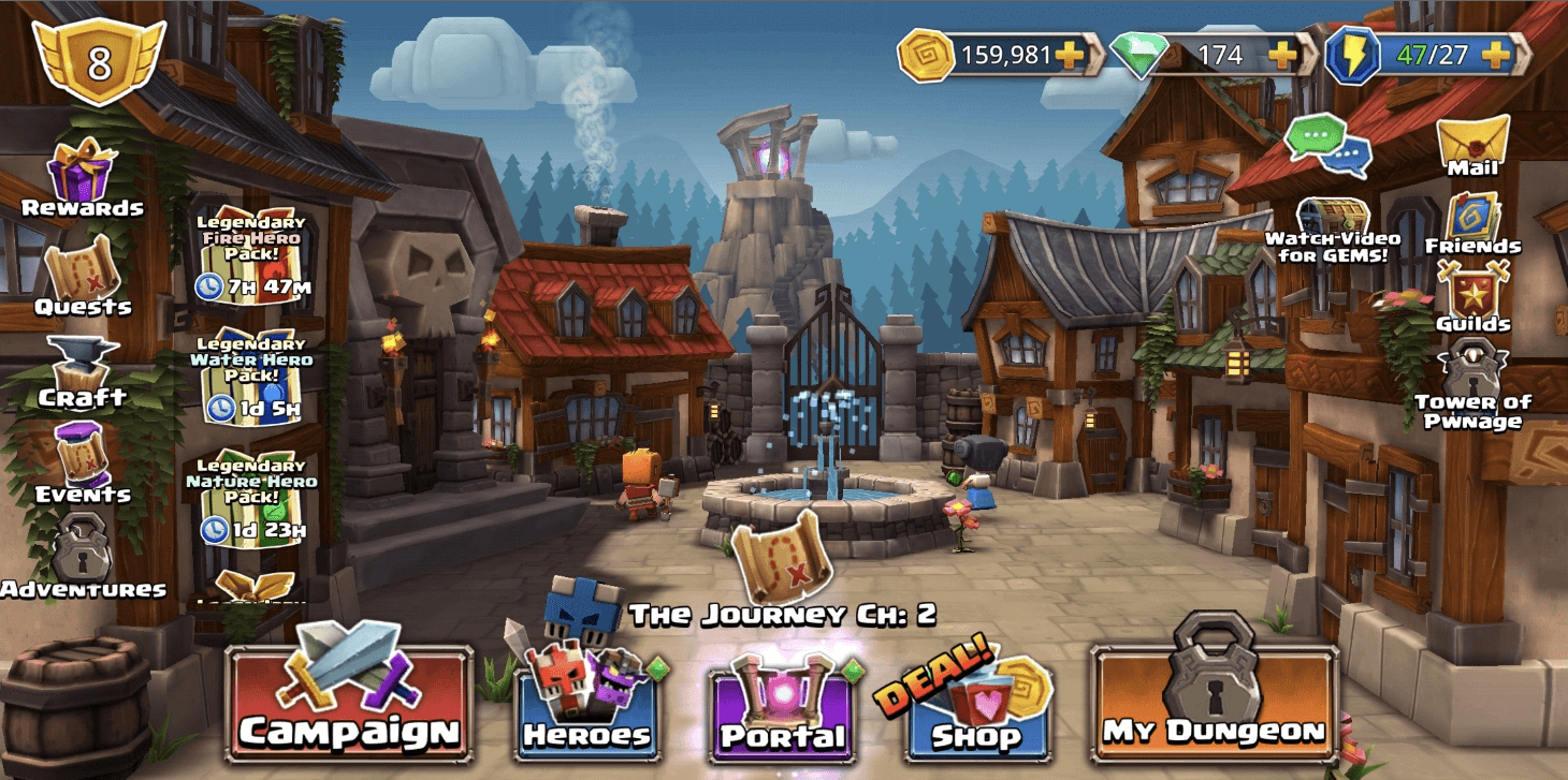
My initial impression wasn't bad. The layout has a classic approach: left column for profile and meta gameplay, bottom row for core actions (campaign, heroes, shop), right column for social features, and top bar for currencies.
But after playing longer, the screen starts to feel like cognitive overload. The quest icon appears on the left side, animated over the Events icon, AND animated in the center of the screen. Three instances of the same icon fighting for attention. Clicking any of them opens the Events modal, which also auto-opens on login. If you're pushing something that hard, it better be worth it. It's not.
The bigger problem is offer fatigue. In the first few days of playing, I was constantly hit with special offers that had no value to me yet. There are more than four stacked at once, scrollable. When everything is a "Special Offer," nothing feels special anymore.
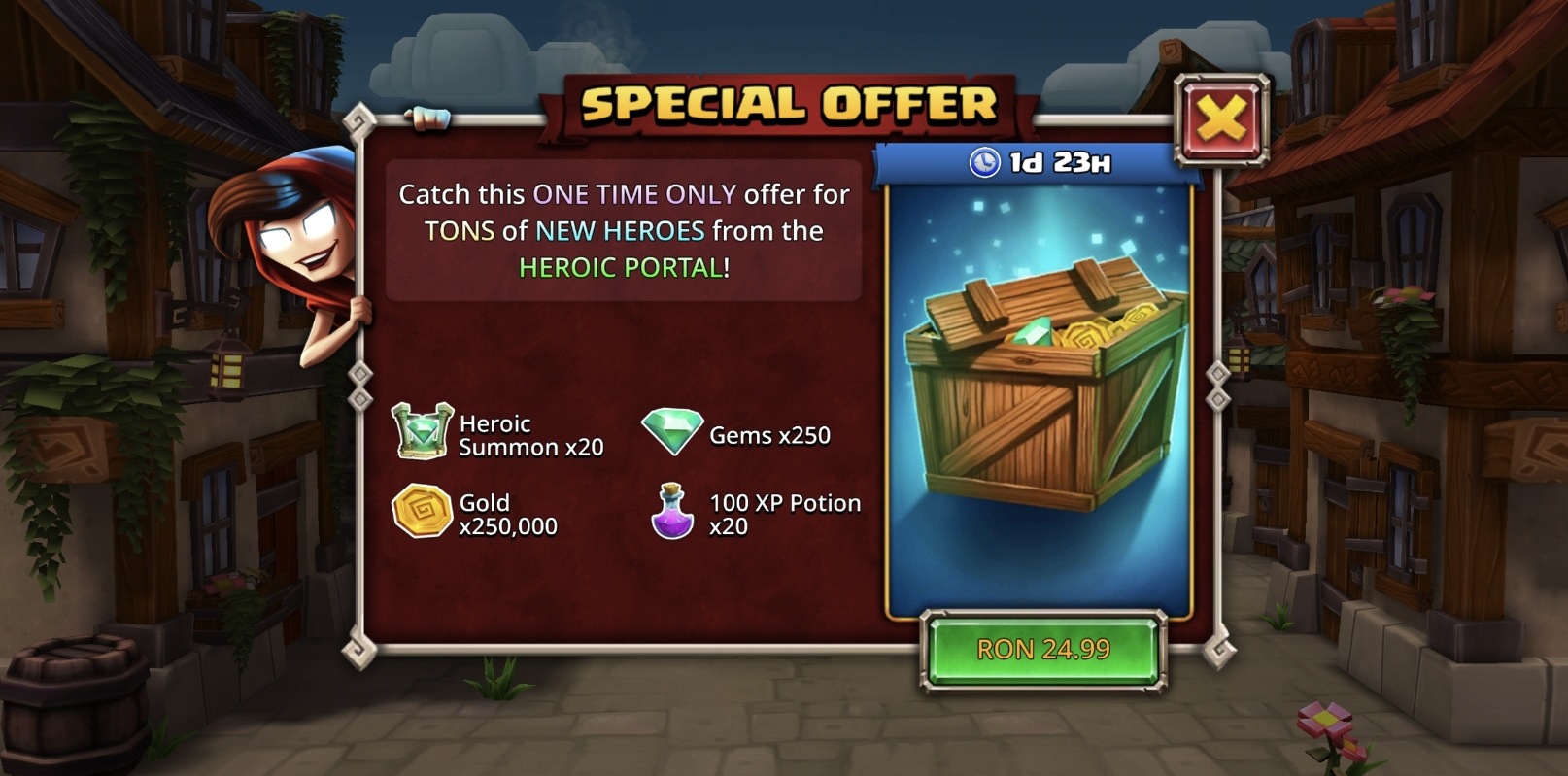
There's a well-known tactic in free-to-play: give new players an offer so cheap and so good they can't say no. A $5 bundle with obvious value. Even if they never come back, you made $5. In Dungeon Boss, that offer came 3-4 days in, by which point I'd already been flooded with "amazing" deals. By the time the real hook showed up, I was numb to it.
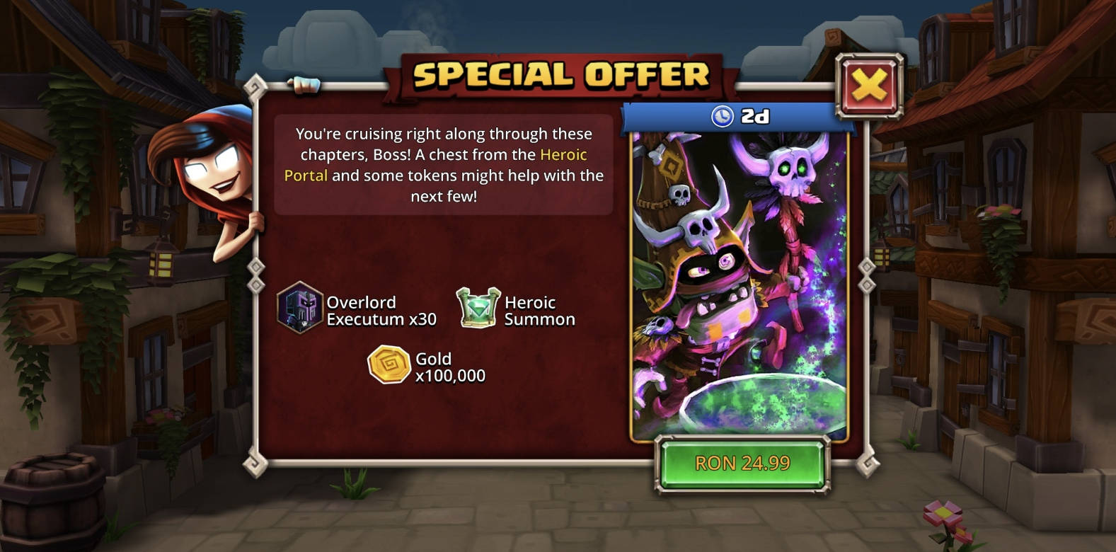
At some point I also got this. No idea what Overlord Executum is. Turns out he's a Hero. He doesn't look like one. I thought he was a crafting resource. The x30 and the simple hexagon border don't help.
Shop Screen
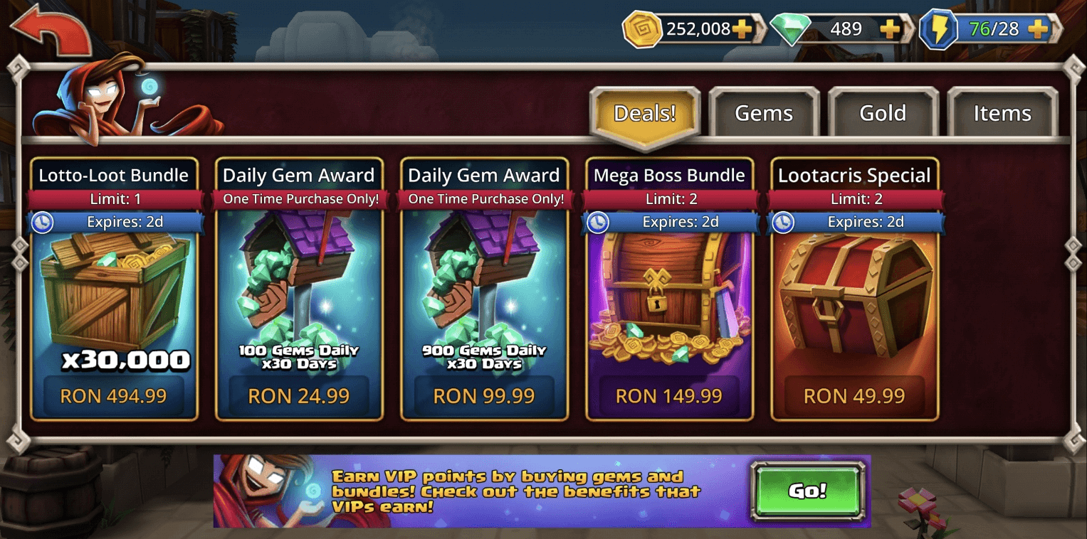
The shop opens on the Deals tab. The first thing a new player sees is a bundle that costs 494.99 RON. That's roughly 100 euros. I'm level 9. Is a 100 euro offer really the best first impression for a new player?
Clicking on it tells me I'll get:
- 30,000 gems (I think these are important. Never used any yet.)
- 50x Heroic Summons (I can summon heroes, but I don't know the difference between the two summon types.)
- 5,000 Stamina (I'm level 9 and never had problems with Stamina. Yet.)
- 100 Raid Tickets (No idea what a Raid is.)
As a level 9 player, I don't understand what most of these things do, and I definitely don't have 100 euros worth of confidence in this game yet. This slot should be something affordable and easy to understand. Get the player to spend their first $5, then push toward bigger offers.
Also worth noting: all deals in this tab give out VIP points, but you can't see that at a glance. More on VIP later.
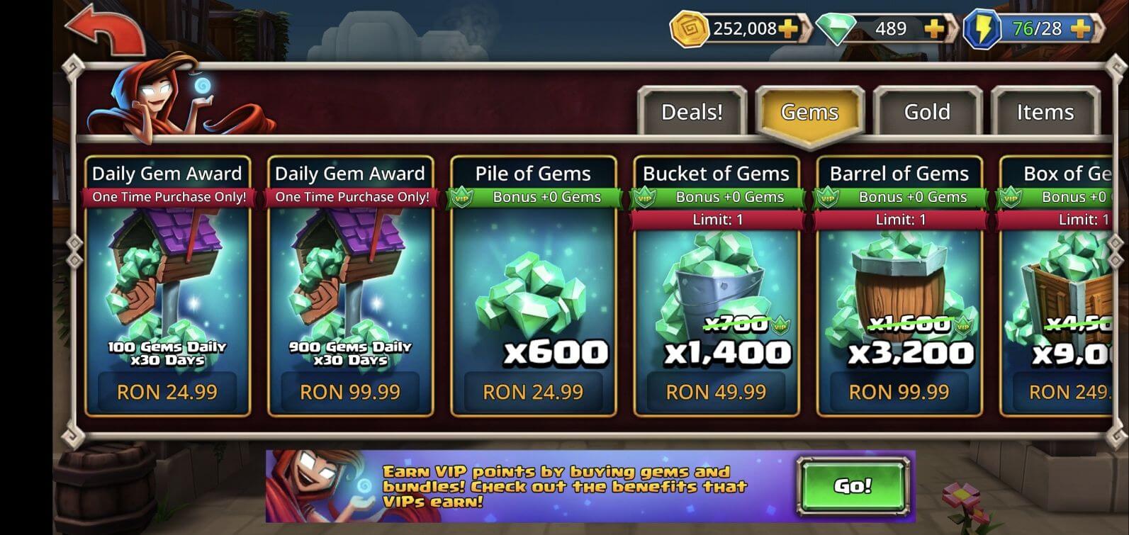
The Gems tab starts better. The first offer is affordable and encourages daily logins: 100 Gems Daily for 30 Days. But what happens if I don't log in one day? Are those gems lost? Can I claim them later? The card doesn't say. That kind of uncertainty can kill a purchase decision, especially for a new player who isn't committed enough yet to guarantee 30 days of logins.
There's also a green bar under each card title showing "VIP Bonus +0 Gems." That's not exactly exciting. If my VIP level is zero, don't show me that I'm getting zero bonus. Hide it until there's something to show.
One positive: VIP-related info consistently uses a VIP icon. That's good. Players can start associating that icon with the VIP system even before they understand what it is.

But then at the bottom of the shop screen, there's a CTA to learn more about VIP. No VIP icon 🤯. The one place where brand consistency would actually help drive clicks, and it's missing.
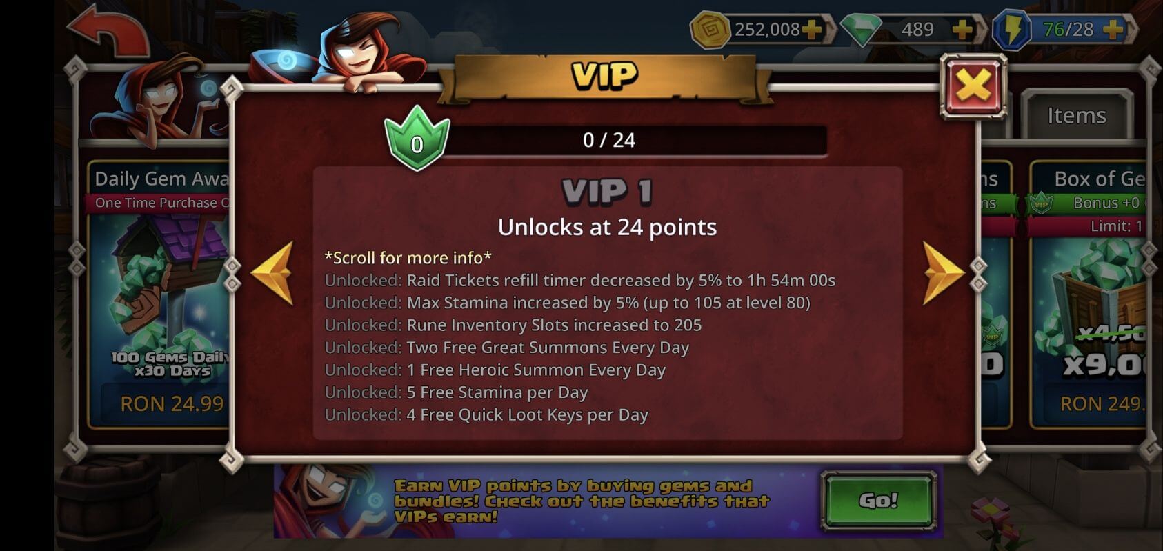
VIP Screen
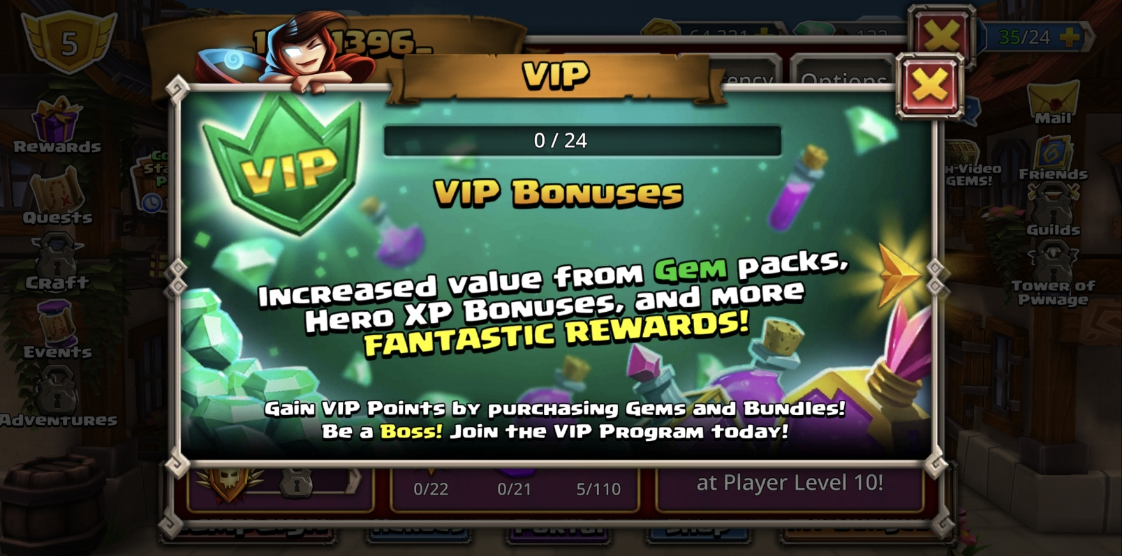
The VIP icon is there. Good. But then I see a bar that says 0 / 24. Zero out of 24 what? Days? Points? Bonuses? No label.
"VIP Bonuses" appears below the bar. So maybe 0 / 24 refers to the bonuses? Hard to tell, because "VIP Bonuses" has the same size and color as the modal title. They don't feel connected. Moving the label directly above the bar in a smaller font would make that relationship obvious.
Below that, a big block of explanatory text. "Gem" and "Fantastic Rewards" are colored differently for no clear reason. The text doesn't actually explain what VIP points are. I'm still confused.
Then at the very bottom, in a tiny text box that looks like a footer or legal disclaimer, sits the most important piece of information on the entire screen: how to actually earn VIP points. You purchase Gems and Bundles. But not Gold? This hierarchy is backwards. The key information is styled like something you're supposed to ignore.
The text ends with "Join the VIP Program today!" Great CTA. But there's no button. No action. Where do I join? If the action is closing this modal and going to the shop, that's not obvious. And the first time I reached this modal wasn't from the shop. It was from here:
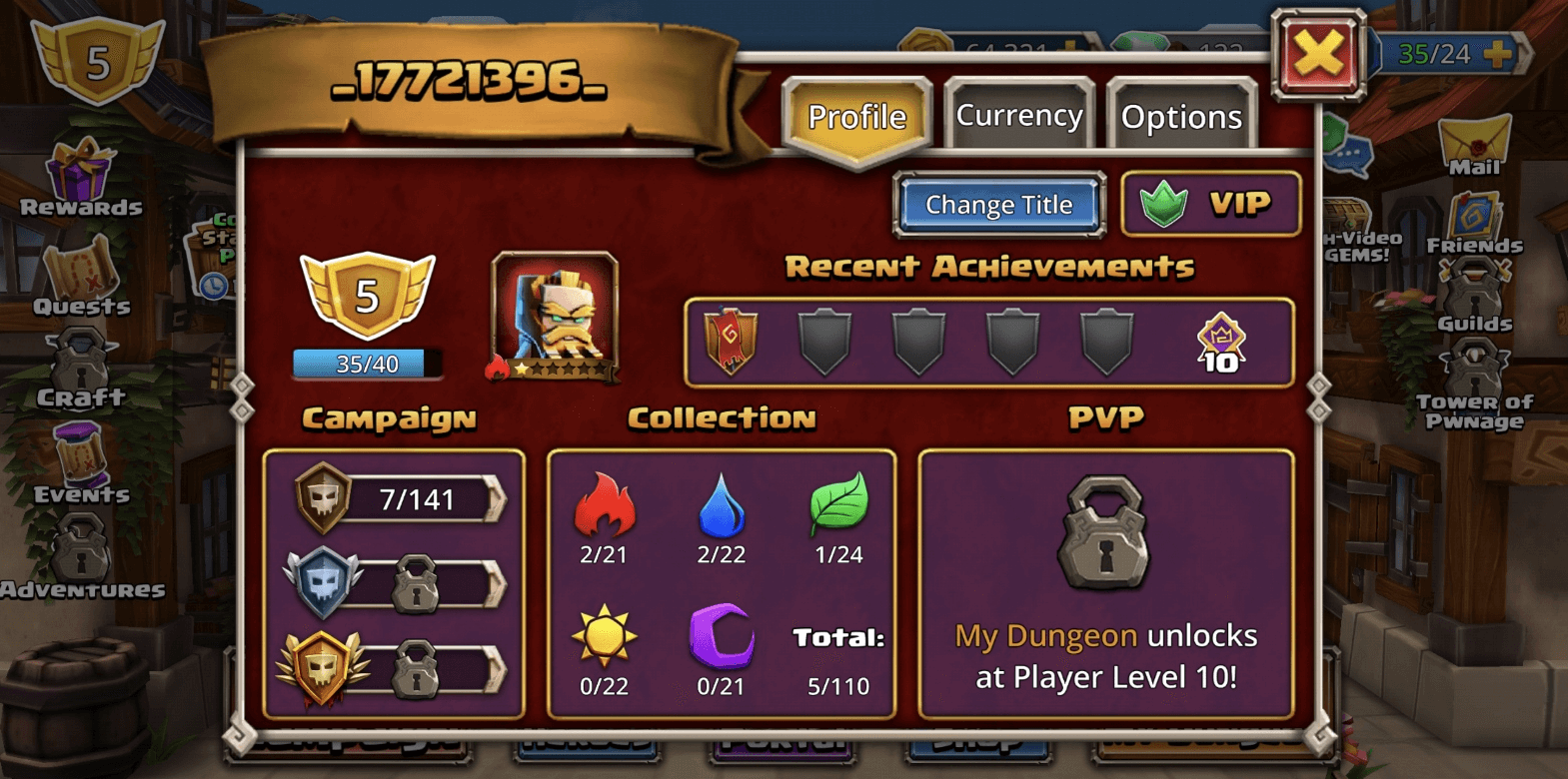
I tapped the VIP icon on my profile. My first assumption was that VIP is a paid monthly subscription. The modal did nothing to correct that.
Then while writing this, I went back to the VIP screen and noticed a yellow arrow:
That arrow is clickable. It's not decoration. It's not part of the background. It leads to this:
A full breakdown of VIP levels and their rewards. Hidden behind an arrow that looks like a texture 🤯.
The VIP screen is probably one of the most important screens in the game for monetization. Right now it's one of the weakest. A quick fix without redesigning the whole VIP journey: restructure the information architecture. Lead with what VIP is and how to get it. Clear CTA with an actual action. If the user already has VIP levels, show the rewards first.
Animation Speed & Auto-Play
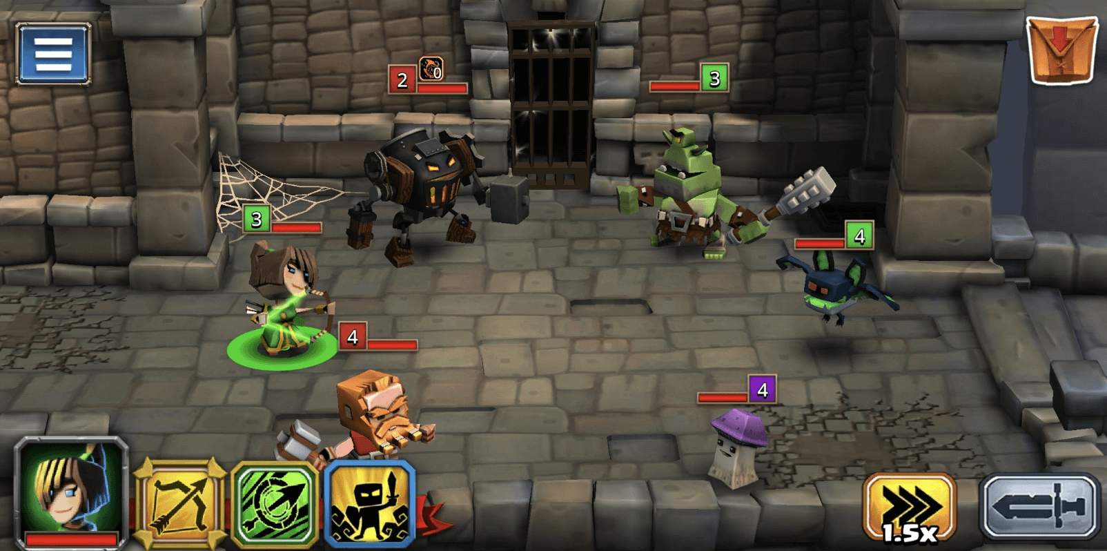
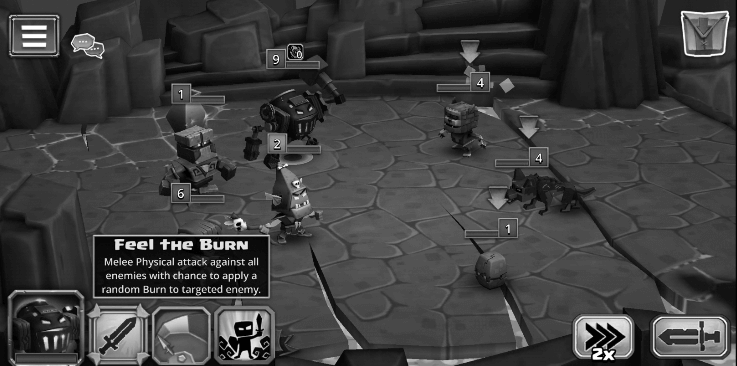
Two things I liked here. The animation speed button lets you fast-forward through combat. And Auto-Play, which plays the fight for you. The Auto-Play button isn't labeled, so I had no idea what it did until I tapped it. But once I did, it changed how I experienced the game.
My first failure came in Chapter 5. Everything before that was a stroll. No challenge, no tactics. Combined with Auto-Play existing, it made me wonder: if this game isn't about tactical fighting, what IS it about?
My conclusion: the game is about the Heroes. Collecting them, upgrading them, building your roster. Fighting is secondary. That realization matters because it reframes what the core UX should prioritize.
Fighting
The game establishes a clear tooltip pattern: press and hold to learn more about something. But spells don't follow this. You have to select a spell first, and a tooltip appears briefly before fading out. Too fast to actually read. I kept switching between spells just to re-read what they do. Small inconsistency, but it adds friction in a moment where the player is trying to learn.
On the positive side, the combat feels good. The animations, particles, and screen shake on certain spells give the fights a satisfying weight.
Accessibility
Deuteranomaly — Fighting
Deuteranomaly — Heroes
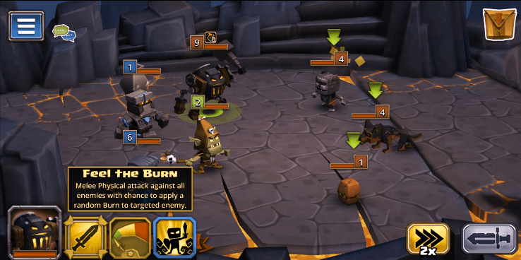
Monochromacy — Fighting
Monochromacy — Heroes
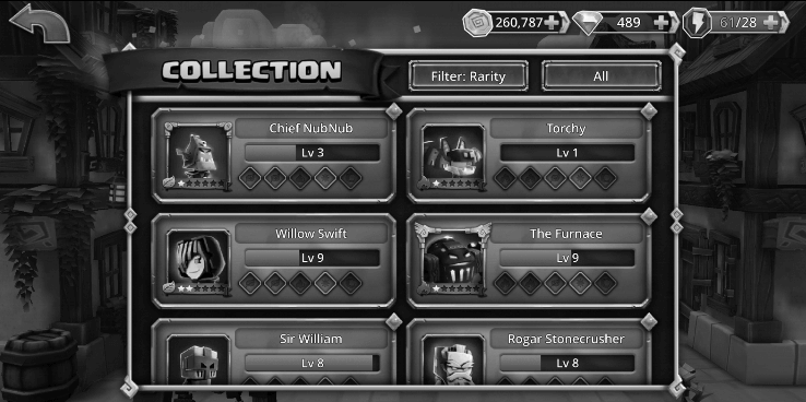
The purple and blue used for hero types are too close in value. For someone with deuteranomaly (red-green color blindness), they're nearly indistinguishable. Icons help in some cases, but on the Heroes Screen it's not enough.
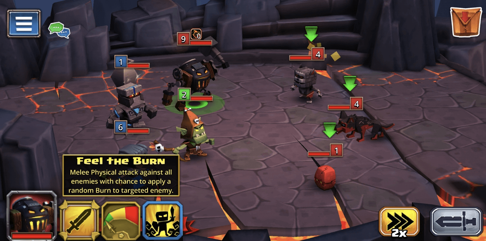
I also tested in grayscale. A lot of people use Bedtime mode on their phones, which turns the screen grayscale. In the fight screens, each hero has a colored box showing their element type (red, blue, etc). In grayscale, that information is completely gone. You can't tell what type anything is.
What is my user name?
There are three ways to set your username: Friends list, Guilds, or the Hero icon on your Profile. Tapping the ID number on your Profile does nothing.
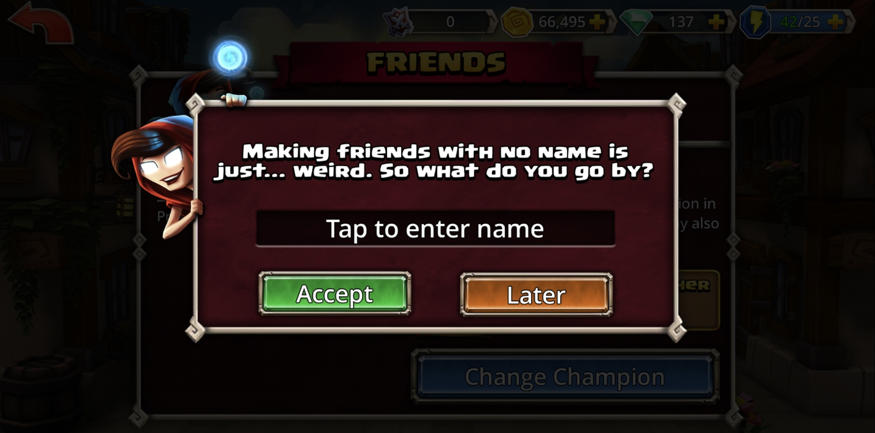
I clicked Friends first. A modal immediately popped up asking me to "Tap to enter name" with an "Accept" button. I thought I was adding a friend's username. The copy is that misleading. It wasn't until I went through Guilds, where the wording is clearer, that I realized the game was actually asking me to set MY username.
Setting a username should feel like a deliberate moment, especially if it's permanent. Not something you accidentally stumble into through the Friends list with confusing copy.
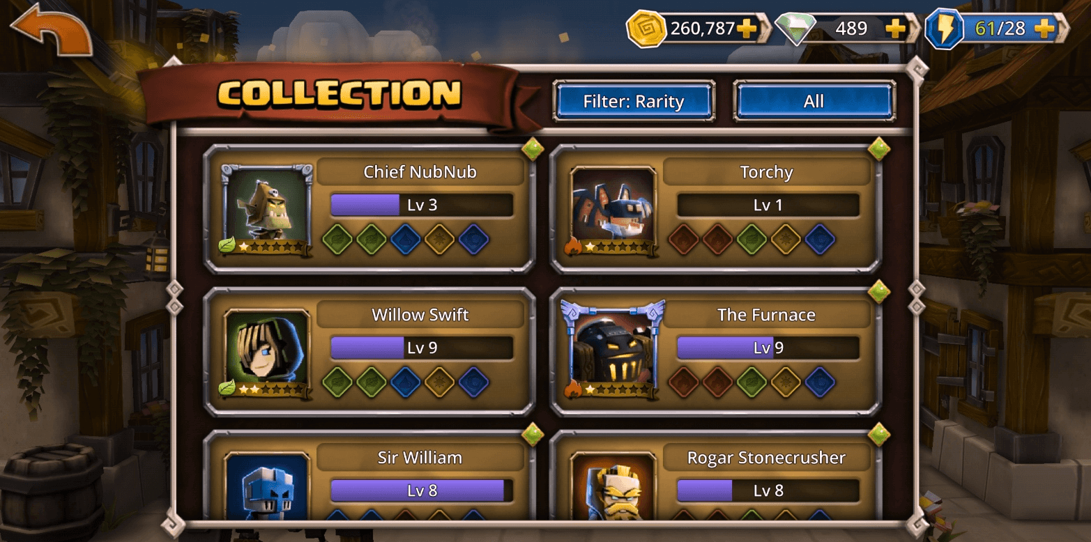
Heroes Screen
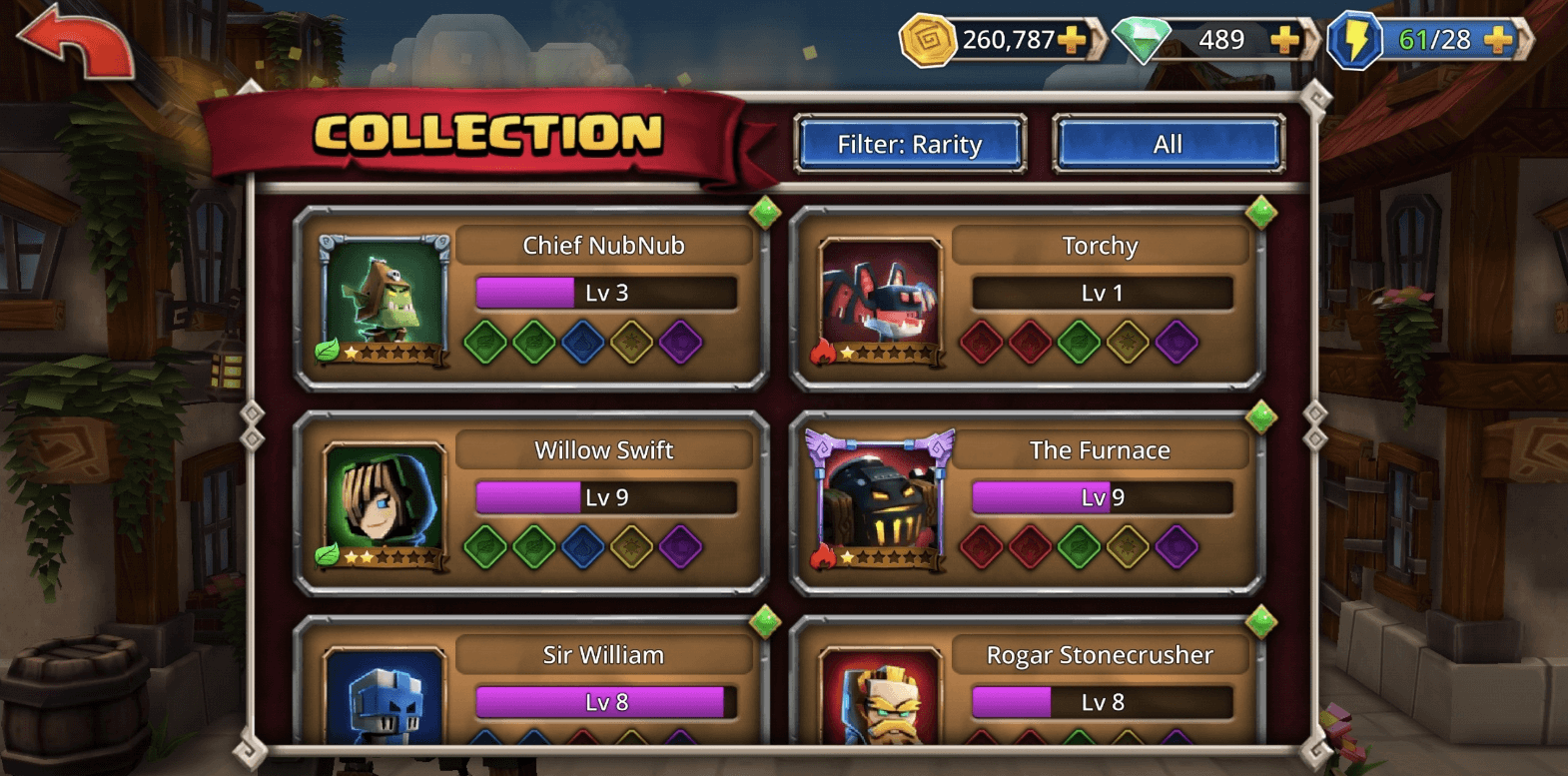
Earlier I concluded that this game is about the Heroes. Collecting them, upgrading them. So this screen should be one of the most important in the game.
The collection shows 6 heroes at a time. There are over 100. That's a lot of scrolling to manage your roster. A grid/list toggle would let players choose how they want to browse, and you could A/B test which view gets more engagement.
The bigger problem: I didn't feel any emotional connection to the heroes. There's almost no backstory, no personality, no universe building. If the whole game revolves around collecting these characters, I should care about who they are. Right now they're just stat blocks.
The Defeated Modal
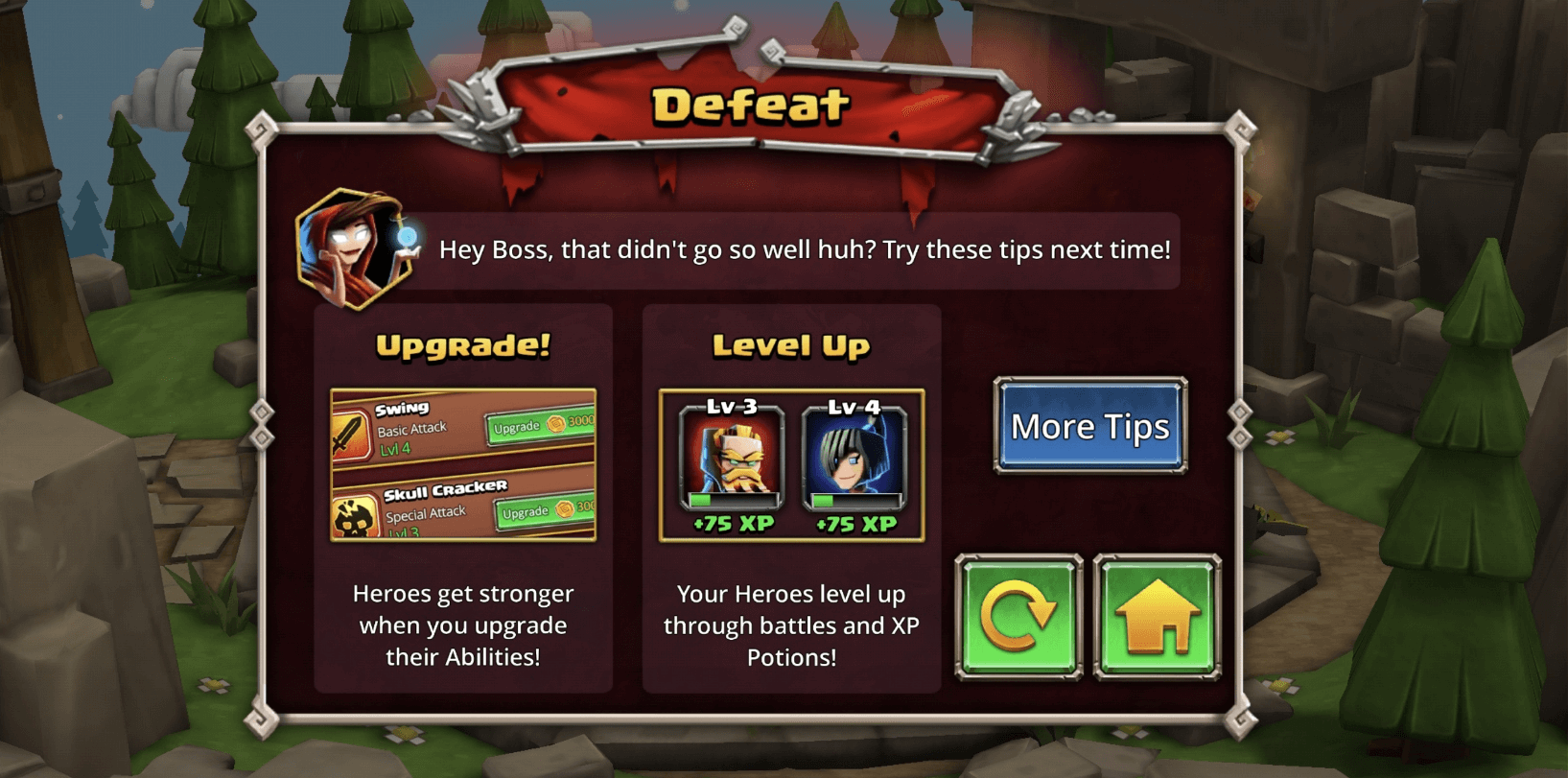
This is one of the best UX moments in the game. When you lose, the Defeated screen doesn't just say "try again." It tells you why you failed and shows you how to fix it, with both text and visuals. Upgrade your spells here. Level up your heroes there. Each suggestion links directly to the relevant menu so you can take action immediately.
Turning a negative moment (losing) into a useful, actionable one is smart design.
New HUB
After auditing the game, one thing became clear: the player has no central place to act on what they need. So I designed one. But first I had to figure out what players actually need. The obvious answers are "I want gold" or "I want experience." But those aren't real needs. They're resources. The real question is: why does the player want gold? Why does he want experience?
I started by brainstorming what the player actually wants to do:
- Level up a single hero (uses XP Potions)
- Level up my whole squad (uses XP Potions on multiple heroes)
- Ascend a hero (uses Evo)
- Get new heroes (Heroic Summons, costs Gems)
- Upgrade hero spells
- Craft runes
To understand the relationships between these actions and the resources they require, I mapped out the game's resource economy:
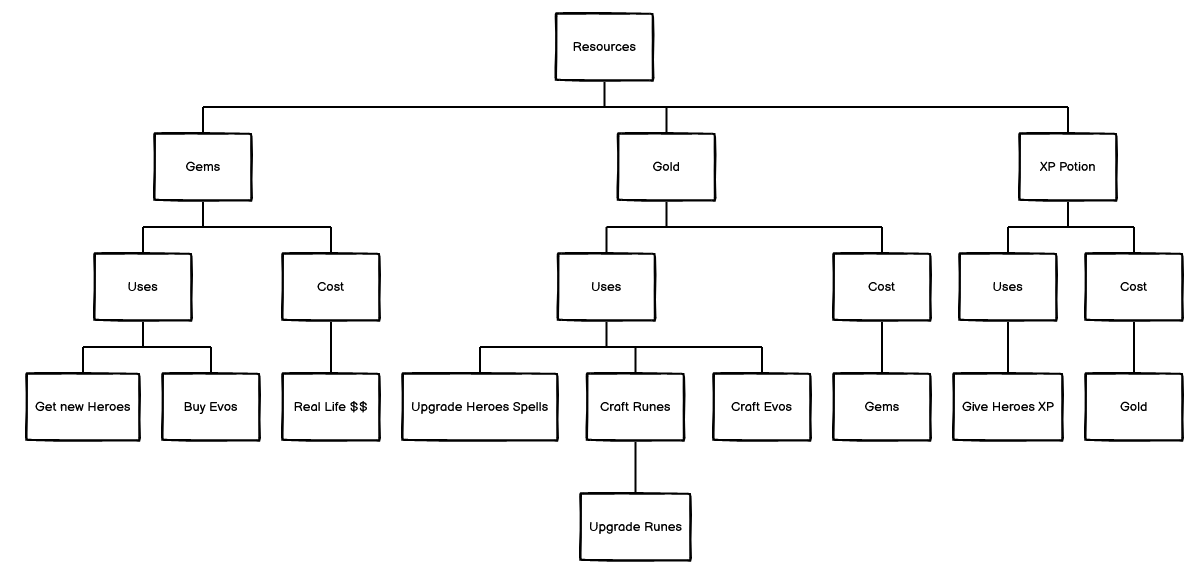
This revealed a clear hierarchy. Gems sit at the top because they're the only resource that can be bought with real money. Gold is the everyday currency used for small transactions like upgrading spells, crafting runes and evos. XP Potions can be purchased with Gold.
Then I reframed it around the player. What is this game actually about? Heroes. I want to improve my heroes. Everything flows from that:
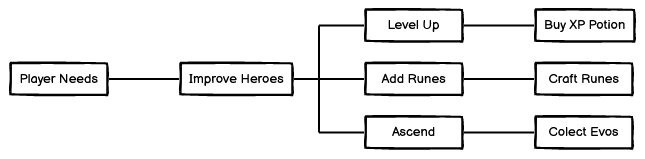
How do I improve my heroes? Level up, add runes, ascend. How do I level up? Buy XP Potions. How do I get XP Potions? Gold. How do I get Gold? Gems or gameplay. Every player need traces back to the same resource hierarchy.
With that mapped out, I started wireframing the hub:
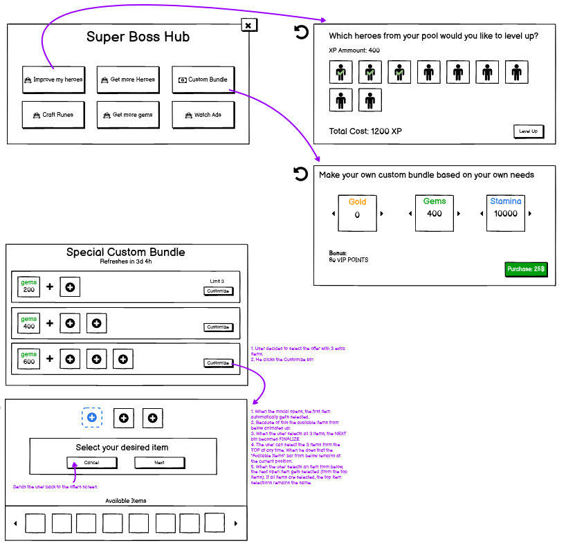
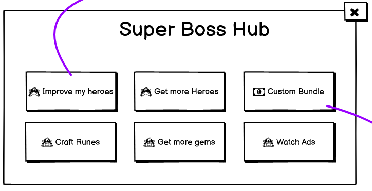
The hub gives the player clear paths based on what they want to do: Improve My Heroes, Get More Heroes, Craft Runes, Get More Gems, and Watch Ads. Each button starts a focused journey.
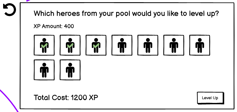
The "Improve My Heroes" journey lets you multi-select heroes and choose which potion type to use. The total cost is shown at the bottom. Simple, direct, no digging through menus.
But what if the player doesn't have enough potions? That question led to a new idea: what if players could build their own custom bundle?
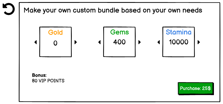
First iteration: let the player pick what they want (Gold, Gems, Stamina), the price calculates automatically, and VIP points are included as a bonus. Straightforward, but limited.
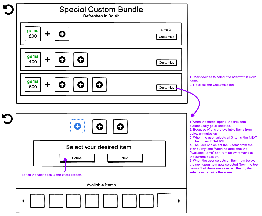
Second iteration with more control:
- Three tiers: pick 1, 2, or 3 extra items on top of a base Gems package
- The available items rotate every few days, keeping it fresh
- The player selects what they want, and the price is only revealed at the end
- VIP points are shown clearly so the player knows they're progressing
Revealing the price at the end is deliberate. Let the player build something they want first. By the time they see the cost, they're already invested in their choices.
Ending
What started as a straightforward audit turned into a full teardown of the game's monetization UX, information architecture, and player journey. The VIP system alone could be its own project. The New HUB came from one simple reframe: stop thinking in resources, start thinking in player goals.